
Friday, 23 December 2016
Tuesday, 6 December 2016

Sunday, 4 December 2016
Deciding on a Logo
Here are my logo variations for my band Infamous:

 I also included a more geometric font to show some variation of ideas. I did this as indie bands like the Arctic Monkey's also have a bolder, thick font rather than a rough, scratched one. I feel the crossing over of text links to the logo of The Strokes, another indie rock band who's logo has a retro appearance, however I don't think my type is retro but rather more Gothic due to the heavy rhythm of Royal Blood's songs.


Most of my font choices have a distinguished, rough brush effect which creates a grungy, urban look. I chose these fonts as they link well to Royal Blood's heavy soundtracks as well have things in common with there logo, as it also appears very hard drawn and rough, despite it being thinner and appearing more creepy. If you look closely you can see that the Royal Blood text consists of black liquid which is spilling, perhaps this links to the bands name including "Blood"
Choosing my logo
To help me choose my favorite type, I printed out a sheet of paper with each of them on, and asked people to tick their favorite. The type with the most ticks I would choose. I chose my audience to tick the logo which they thought best fitted the genre as well as which was their favorite, here are my results:

It appeared that the font Deathrattle was the most popular, I also agree as it is a rough, gritty font but you can still make out what it says unlike the fourth font down. I will incorporate this type with my digipak when creating my panel designs as well as making my magazine advert.
Thursday, 1 December 2016
Draft 1
As you can seen my first draft is the second half of my music video, I filmed the torture scene first as it is the most challenging scene is my music video, due to the various quick shots used and the rhythmic editing of the hits going to the beat of the soundtrack. For this draft I also managed to finish all the animated parts required.
As you can see, I have made little progress on my animation due to me drawing 30 frames a second. To make quicker progress, I will change this to 15 frames a second. I feel this will improve the quality of my animation also because you will be able to see each frame individually whereas on this clip, the drawings seem very blurry. I feel this is because I rendered the video in 25 frames per second but drew 30 per second.
Storyboard Comparison
Here is my story board comparison, towards the beginning of the sequence my drawings and shots are very similar however I start to improvise towards the end as in some positions I block the soft box lighting as well as some of the extras.


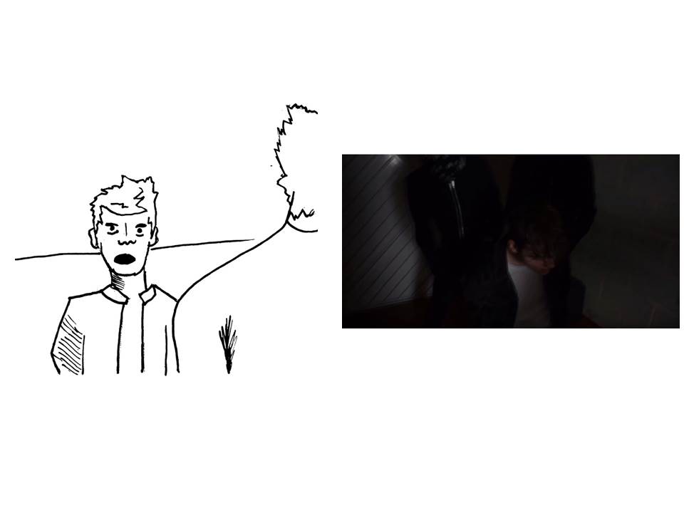


The shot I used to re-create my sketches was accidental. For health and safety reasons, the protagonist was going to rock the chair and lean against the wall in one shot. Then in the next shot, he would fall. During this process the extras would be fully in control, lowering him down gradually before he hits the floor. However, at the moment of the protagonist rocking to the side, the chair slips due to the water on the floor and the tape that is attaching his legs snaps, sending the chair out of frame and the actor falling on the floor for each shot.
There were no injuries however reflecting on this, next time I will make sure the floor is dry before performing any major or minor stunts.


Subscribe to:
Posts (Atom)