
When a music video, digipack and magazine advert is released, the design of a consistent house style needs to be maintained throughout. Because my music video follows a very illustrative style I have decided to keep this as a running theme. I also think it would be good to relate to the narrative of my music video as it is very psychological and confusing.
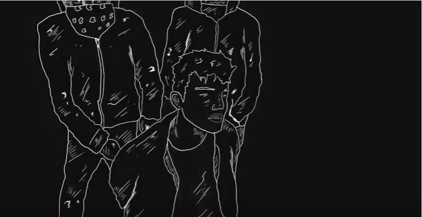
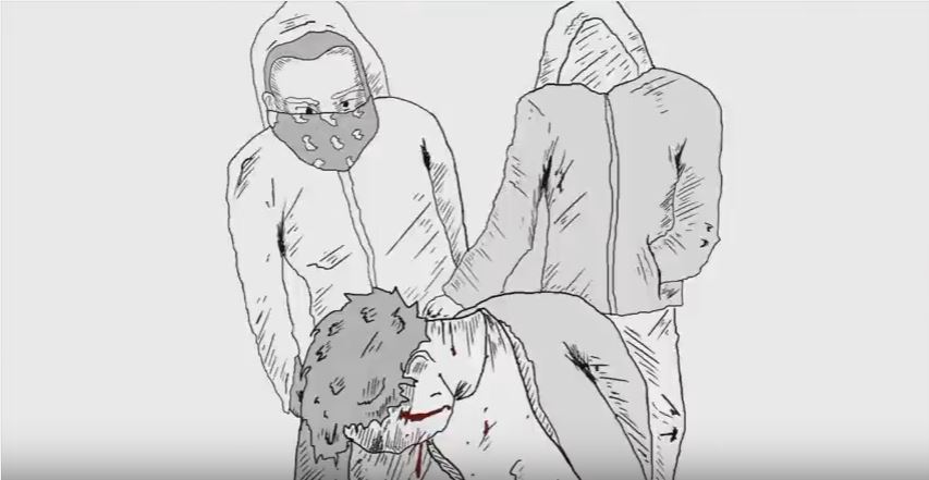
Screen Shots of my illustrative style in my music video:

Front Cover
Here is one of my first initial ideas which I have illustrated using secondary sources and Photoshop:

What I would change about this composition is the type of photo I have used, I would prefer to have a boy looking out, above a city rather than looking up to the city positioned below it. I also think a photo from the secondary sources perspective would be extremely difficult to take. I like the typography I have used as it appears very "glitchy" and distorted like my protagonists memories from the night before in my music video narrative. It also looks very damaged and has a gritty style which relates to the indie rock conventions very well.
This is the secondary photo I have started on:
 Initially I was thinking of having a photo where the artist faces the camera head-on, however I like the idea of him slowly turning into an illustration further back into his face.

To start, I am cutting the model out of his photo's background, this requires the pen tool. The pen tool allows you to bend and curve lines you so you get a realistic, clean selection rather than a straight, rugged one. With the pen tool, you select all around the models face until you have created a perfect shape all the way around his face and shoulders.
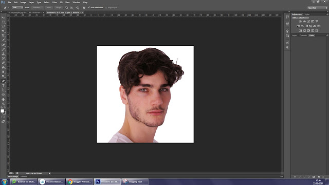
I have then copied my artist onto my own formatted background. I then turned the background black however you can still see the white previous background through the gaps in the models hair. To fix this I have to use a rubber with a low opacity to subtly remove these white patches.


As you can see in the above image, using a soft rubber with the opacity at 19% I have gradually started rubbing out the white background in my models hair. I have completely rubbed out the center of the white background. However as the background gets closer to the hair, I subtly still include faint parts of the background in order to make the picture look realistic as if the model is stood with the black background instead of pasted onto it.

As you can see I have removed the white gaps between the models hair, however it still appears like he isn't part of the black background. This is due to the pictures lighting being so bright. To change this, I need to now subtly rub around the edges of the image with a rubber on a low opacity. This will make him look like he is coming out of the darkness. Also using a black paint brush with a low opacity, I need to darken the shadows on the artists face to make the picture brightness lower.

After I darkened the face and faintly rubbed the edges of the image, I felt the image was too bright so I went to Image - Adjustments - Brightness/Contrast where I lowered the brightness and increased the contrast using the slide bars I have shown above.


.jpg)
As you can see they are both highly illustrated and are centered around an average lifestyle which is transformed into a wider, more exciting one, which is what happens in my music video. I prefer the 1st album as it includes more patterns and geometric elements which I feel will suit my digipak.


This is the texture overlapping the sound waves:

I think this is a very, simply but effect design that is needed in my digipak inside cover as the inside designs tend to be less complicated and busy.
I really like the detail on this panel except I feel it could be too detailed as inside covers are meant to be more simple. I also like this design as it continues a consistent house style all the way through the digipak.

Here I have placed the gritty, mono print texture over the top of the pattern in order to reflect the genre's ideology. I cannot decide which one I prefer.
Digital Thumbnail 2
Here is a step guide to how I have made my second thumbnail / digipak cover design idea. This idea was my first, it is based around a close up, profile shot of the main artists face, where one side of his face is normal and the other side is illustrated in white with a black background. I feel this links to my music video as the narrative that takes place is a teenager stuck in an animated reality.This is the secondary photo I have started on:


To start, I am cutting the model out of his photo's background, this requires the pen tool. The pen tool allows you to bend and curve lines you so you get a realistic, clean selection rather than a straight, rugged one. With the pen tool, you select all around the models face until you have created a perfect shape all the way around his face and shoulders.

I have then copied my artist onto my own formatted background. I then turned the background black however you can still see the white previous background through the gaps in the models hair. To fix this I have to use a rubber with a low opacity to subtly remove these white patches.


As you can see I have removed the white gaps between the models hair, however it still appears like he isn't part of the black background. This is due to the pictures lighting being so bright. To change this, I need to now subtly rub around the edges of the image with a rubber on a low opacity. This will make him look like he is coming out of the darkness. Also using a black paint brush with a low opacity, I need to darken the shadows on the artists face to make the picture brightness lower.

After I darkened the face and faintly rubbed the edges of the image, I felt the image was too bright so I went to Image - Adjustments - Brightness/Contrast where I lowered the brightness and increased the contrast using the slide bars I have shown above.

Next, I have illustrated half of the models face whilst gradually erasing it. I have also darkened part of the illustration to allow the drawing and face merge together. I have not taken this design further as although I thought it was a good idea, I don't think it has worked in production and will have to think of another, illustrative design to relate to my music video.
Thumbnail 3 / Design 3
For my third design, I was thinking of doing a cover that was completely illustrated in white with a black background. The cover would consist of highly detailed patterns and textures. I took inspiration for this idea from Mika's album covers:

My idea is to have my protagonist from my music video illustrated in black and white with various patterns streaming out of his eyes and mouth. This will imply that the fiction, animated world that features in my music video is slowly consuming him. I also think the overall design will look very dark which reflects the genre's ideology accurately.

This is the type of illustrative patter I want to include:

This type of pattern was inspired by graphic illustrator Iain Macarthur who also combines realistic figures of animals and humans with illustrative pattern. Using his style I feel like I can convey my music video's narrative well.
Left Inside Cover Ideas
Idea 1
I feel that I need to advertise the main artists more in my digipak rather than having it all illustrated, most digipaks conventionally have the artist photos on the inside of the digipaks. My first idea is to present the artists in black and white on a black background. Except some parts of the artists will be covered as the threshold on one of the images will be changed.
I have got this inspiration from the AM digipack by the Arctic Monkeys:

This is the secondary source I am using for this quick thumbnail:

This photo is the band Royal Blood, whose song I am using for my music video. I have chosen this photo as my artists will be dressed in similar mise-en-scene in my photo.

What I have done so far is selected the background of my image and put a black layer behind it, this is so when I delete the background, I will then have a black background underneath.

Here is the main image with the black background, as you can see it appears very un-realistic and obvious that it is photo edited. Now I am going to change the Threshold of my main image by going to Image - Adjustments - Threshold.

In like this effect as the artists subtly blend into the background, it also fits my black and white album theme.

I started to add the geometric sound waves that are going to appear in my music video. This will link the digipak to my music video.
To reflect Royal Blood's heavy, gritty sound. I have made some mono-prints and rubbings which I am going to use as a texture on the sound waves.


I think this is a very, simply but effect design that is needed in my digipak inside cover as the inside designs tend to be less complicated and busy.
Second Inside Left Cover Idea
This is my other Inside left cover idea, I have incorporated the pattern on the cover work, into the background of my secondary photo:


Here I have placed the gritty, mono print texture over the top of the pattern in order to reflect the genre's ideology. I cannot decide which one I prefer.
Inside Right Cover
The inside right cover, covers the CD case, it is the flap you open up when wanted to get to the CD. This conventionally has the most simple design as it is already accompanied by the left inside cover image.
Idea 1

This is my first idea for the inside right cover, I like this style because it is very simple yet effective. I am trying to keep the pattern work a consistent design along with the distorted, rugged sound waves. I also added the mono-printed texture I used earlier. However, this idea I was also thinking of doing for the back cover along with the track list so I will re-think my ideas.
Idea 2

CD template designs

This is my first inside template design, I feel the pattern work has been overused in my designs so I have included the animated distortion to show a bit of differentiation. Even though the pattern has changed I still feel the grungy, decayed house style is maintained throughout. This design is the simplest as it will be mostly covered by the CD itself.
 Instead of making the above design be copied across two panels (looks repetitive) of my digipak, I feel like i could use a screenshot from actual video across both of the panels. This has been done of previous digipak designs and I feel like if will break up the layout and composition of mine.
Here are the possible screenshots I would use, it will definitely be the ones which are taken in the most action packed scenes; torture scene and fight scene:

I like this photo as it keeps the illustrative house-style which i'm trying to make consistent throughout my digipack whilst advertising the music video. I also like how the realistic background is very gritty and urban which reflects my genre's ideology.

However I also really like the angle and framing of this picture, I also like how he light just captures my actors makeup as well as well as the water. Along with the brick wall background, it really conveys the violent ideology of the rock genre. As well as the dark theme's of the indie rock genre.

I like how my actor is fading into the background, I like the fact the main attraction of the image is off center to imply a distressed environment. It also is one of the most exciting parts of my music video which I think promotes it well.

Here I have tried to incorporate my illustrative house style along with the image which I feel is very effective, however I don't like the was the line passes through the actors head. I need to make it fade of erode away as the line draws nearer.

I feel like I would like to use this idea in my digipak as even though this was an experiment, I feel like it has turned out really well and has a very professional edge.
No comments:
Post a Comment