Question 1. In what ways does your media product use, develop or challenge forms and conventions of real media products?
I think my magazine advertisement would feature on magazines like NME, Q and Fader due to its indie genre. However due to the heavy sounding music and dark designs, it could possible feature on rock magazines like Kerrang and Rock Sound as these types of gritty graphics appeal to the rock audience heavily.
Question 2. How
effective is the combination of your main product and ancillary texts?
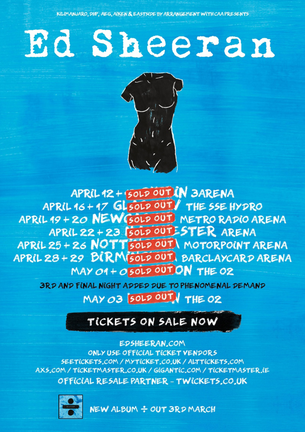
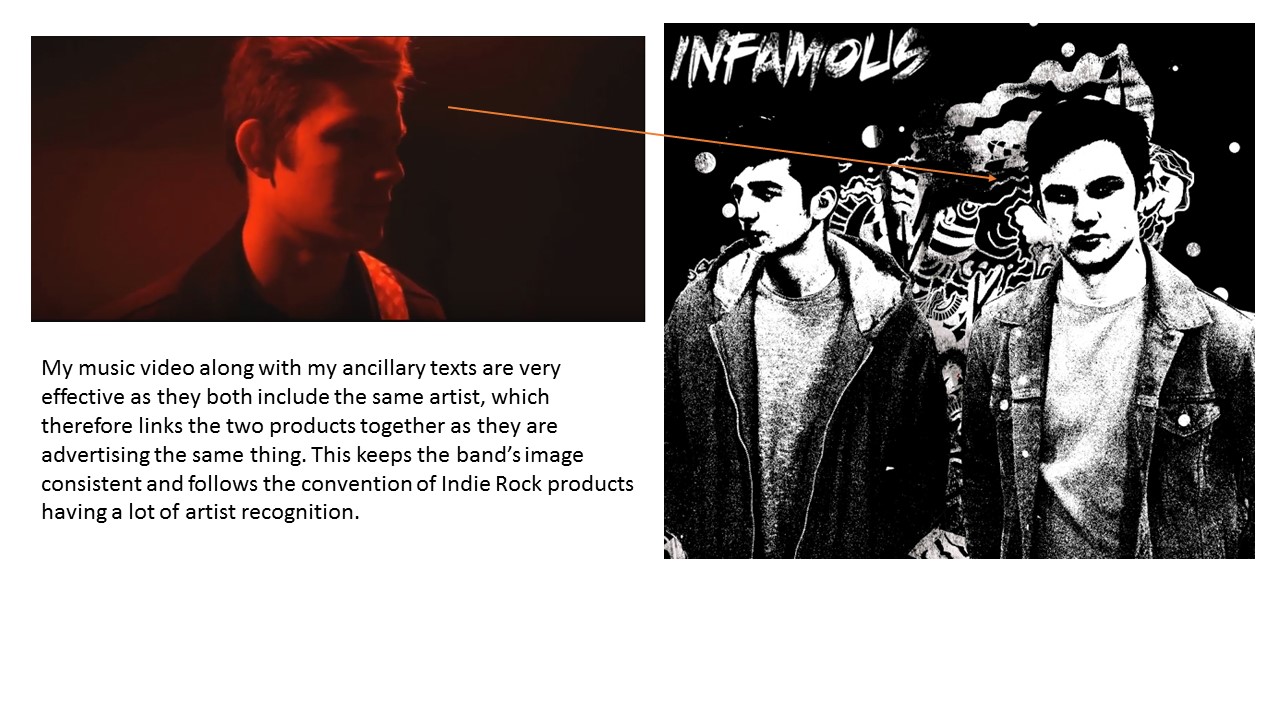
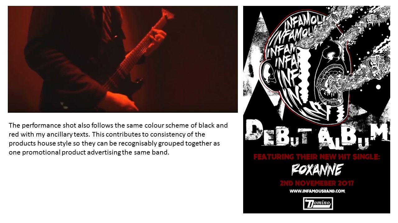
I feel my ancillary texts are very effective together because as I have proved, they share the same consistent house style as well as the same graphics which promote the band. This is effective as audiences can recognize them as the same promotional package and can relate the designs directly to the band. An effective promotional package is one in which has the same style thoughout each promotional product. An axample of this is Ed Sheeran's new album "Divide".
The album cover depicts a black painted on divide sign with the work divide in white, inside the divide symbol. The divide symbol is placed on top of a washed out blue, tie dye effect. This type of painted aesthetic is also seen on advertisements for convert posters are well as each one of his songs on youtube:
- Album Cover
- Concert Poster
- Thumbnail Design for Youtube (Different one for each song)
Choosing My Institution
Both my ancillary texts link due to that fact they both reference the same independent institution; Domino. I chose this institution as Domino is a very famous record label due to the rise of popular band Arctic Monkey's. However, despite this popularity, it is still always known as an independent label for Indie Rock bands, therefore I thought it was best suited to my band as like my band Domino Records more about the music than their image. My bands music also fits the genre of music Domino Produce and distribute as well.
As an overall promotional package, I feel my products are very effective as not only do they include the conventions of real-life media texts, but they also link extremely well on different levels, be it colour scheme, graphics and screenshots from the music video.
Question 3. What have you learnt from your audience feedback?
Overall from my feedback I feel that I have learnt to take more precautions when filming in the dark, I have also learn that linking promotional products together and creating synergy is very effective as a promotional package.
If I could create my products again I would add an album name to follow another convention of a digipak as well start my music video animation earlier to improve the quality of the "Take on Me" aesthetic I am trying to create.
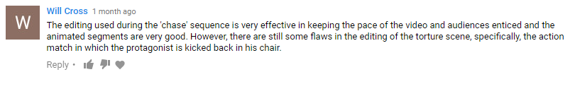
Since I posted my music video, I have received various comments from other Youtube accounts on it:
All the comments so far have been very positive, the latest comment actually took the time to analyse it and say what they liked about it. To gain more feedback I will create an audience viewing and then film them giving feedback on the video.
This is my final edit, nothing new has been added to the editing sequence however to achieve that professional music video look, I decided to colour correct my footage and add letterbox bars at the top and bottom of the video. Colour correction and letterbox effects are a convention in music videos as producers want every shot to look artistic and the actors and artists to look good, advertising them well.
Colour Correction
For my daytime shots here is the colour correction settings I used:
Before Colour Correction:
After Colour Correction:
As you can see I have slightly altered the tone of the footage, creating a more dark, dank mood. I feel this fits the scene as my protagonist is waking up to a dead body.
Before Colour Correction:
After Colour Correction:
I also feel the letter box effect adds a more focused view onto the music video, it stops alot of empty space being shown around the characters.
Brightness and Contrast
For my night time scene I had to alter the brightness, here is the brightness adjustments for my town scenes:
Before Brightness:
After Bright:
This is as far as I could brighten the video footage without the footage looking bad quality and having a grey tint over it.
Before Brightness:
After Brightness:
I feel it has been more effective on the chase scene as the figures behind the protagonist are now more defined and obvious.
Brightness and Contrast for the Fight Scene
My fight scene occurred in a much darker location, therefore I added more intense brightness to the footage than in the town scenes:
Before Brightness:
After Brightness:
I feel this has also improved the defining of characters as the edges of the footage before seemed to fade.
I decided to print off my Digipak so i could create a focus group around it, therefore I will know what people think of it and if the design is of a professional quality:
(Digipak is far Right)
Focus Group
Overall my audience seemed to like my design due to its illustrative style and its continuous house style that I have shown all the way through my designs.
However they feel that the band name is very hard to make out as it is merges with the screaming mans face on the front cover. They also suggested adding an album name just so they are more defined and obvious.
Another criticism is the editing of the artist shot, as it looks cheesy due to the specific filter, one of my audience members feel it would look alot better without the filter.
Draft 4 is my second to last draft as I have finished all the filming, animation and editing. All that needs to be added is the colour correction and letterbox's to make it look more professional and to have that movie aesthetic. I will also brighten up parts which appear very dark.
Re-Filming Fight Scene
As precautions to the footage becoming too dark, I turned my camera ISO from 650 to 850 as this will improve the brightness without harming the quality too much. I also filmed very close to the lights, however some areas still appear very dark which I will edit in Premiere Pro.
Shot 1:
Sketched Panel:
Add caption
This shot I need to lighten up through Premiere Pro, however you can still understand what is happening as the shot isn't very long and leads up to a lighter shot.
Shot 2:
Sketched Panel:
Here I have swapped two shots around, this second shot is meant to be a close up of the protagonist staring in anger at the animated figure. However that is not the shot that comes next. This over the shoulder shot i really like as it is well lit and tracks the protagonist as he slowly struggles to his feet.
Shot 3:
I changed this shot slightly from a close up to a medium shot, however I feel the protagonists emotions and wounds are still focused upon.
Shot 4: As planned, the next shot is a cut back to the over the shoulder shot.
Shot 5:
Sketched Panel:
I feel the zoom in this shot is very shaky however it still works as an effective transition to the animation. This shot also needs to be brightened however I feel the darkness also adds a sinister look to my protagonist.
After the Fight
The fight now ends after the protagonists jump kick which makes the animated figure dissolve away. The next part of the fight was meant to be both actors firing energy at each other in a cliche, cartoony way:
However I do not have time to finish the drawing of the frames so I created an alternate ending.
Shot 1:
To build up the dramatic outro of the song, I included a performance shot of the artist strumming the guitar quite fast and violently.
These next two shots are inspired from the ending of Take on Me by Ah-Ha, one of my main influences for the narrative of my music video.
This is where the protagonist who is essentially a comic book character, is caught between the real world and comic book world. The scene shows the boy violently struggling in pain.
I feel this links greatly to my music video narrative as my protagonist is also seen caught in an animated world as well as a real world. I think it links to the beginning of the music video well, as it shows he has passed out. Perhaps implying that it was all a dream.
Shot 1:
Shot 2:
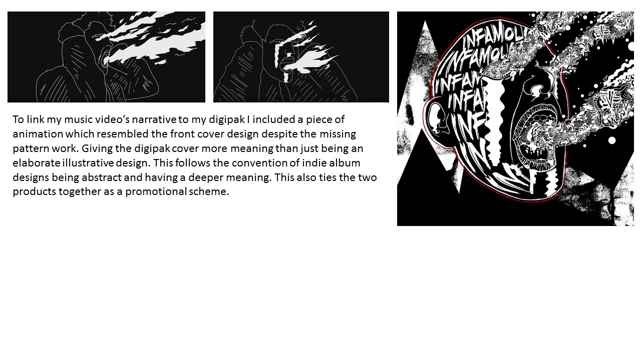
I included this second shot as I want to relate his screaming face to the album cover when animating it. When animating I wasn't able to go into much detail however I still think it is effective in linking to the design.
Animation Transitions
In this draft I added the animated distortion that transitions the real life footage into the animated parts: